Grafana
Grafana is the de facto dashboarding solution in the cloud native space.
Chances are, that it is already present in your organization. If not, you can quickly and easily learn it thanks to its many integrations. Most metric stores can be used as a datasource and you will see the familiar visuals of your metrics.
Grafana, in the past years, moved into a strategic spot in the cloud native ecosystem. It recognized the fragmented experience cloud native offers, and decided to be the centerpiece for observability. They integrated all three legs of observability in a single dashboard:
- doubled down on Prometheus as the metric solution
- developed a point solution for logs: Loki
- and traces: Tempo.
With these assets, Grafana became the go-to tool for cloud native observability.
Daily workflow tips
Alerts
Setting alerts in Grafana is straightforward and user friendly. In the edit view of a panel, where you define the query, navigate to the third ‘Alerts’ tab.
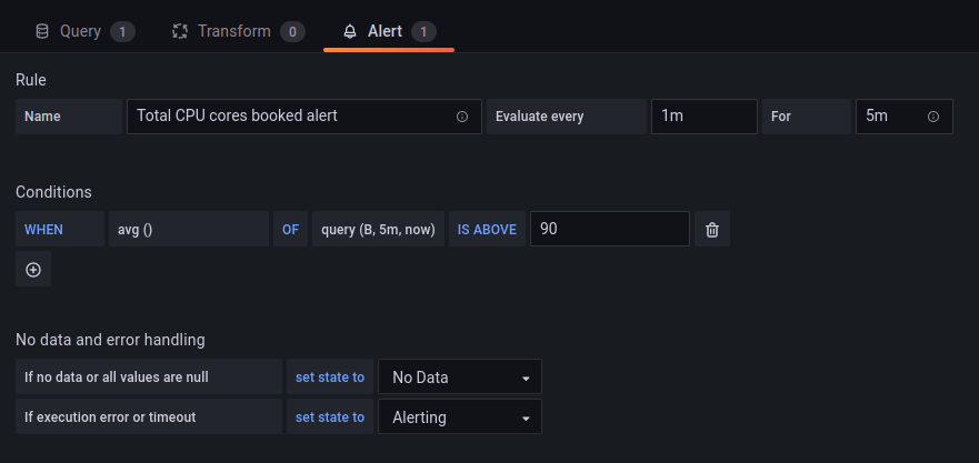
The only catch is that you cannot set an alert on a templated dashboard. For those, you have to clone the dashboard, remove the templating variables, and set the alerts on this cloned dashboard.
Prometheus alerts or Grafana alerts?
I recommend using Grafana alerts. They are much easier to set on the UI and they are better visualized.
You may still have a good set of Prometheus alerts, but I recommend exposing your developers to Grafana alerts. I had better results with Grafana in terms of turning alert creation into a habit for developers.
info
Grafana 8 integrated Prometheus alerts, so Grafana and Prometheus alerts moved closer together.
What makes a good alert?
Good alerts have some key characteristics:
- a good alert has a help text explaining what is happening, the possible causes, and suggests action plans. When you got an alert on the weekend, you will be grateful for this handy contextual information.
- a good alert is actionable. If you don't act on an alert, time to reconsider having it in the first place.
Day-two operations
Templated dashes vs service specific dashes
Best practice is to start out with generic dashes with templated charts. Then clone, and make them service specific.
Make them your own.
When templated dashboards get slow
Templated dashboards may get slow over time due to the number of items they display by default. This is true for the dashboard packages in Gimlet Stack. A dashboard that may be perfect for 20 deployments, can get sluggish with 80.
It requires careful planning to know when to split dashboards and a labelling strategy that serves your orgnization well. Groups of engineers rarely need an overview of 50+ services. Give yourself a break, move away from generic templated dashboards before the number of items displayed degrades user experience.
Dashboards included in Gimlet Stack 
Gimlet Stack builds heavily on Grafana. If you install Grafana with it, Gimlet Stack sets up a set of dashboards and alerts by default. Gimlet's operational workflows heavily rely on the presence of these dashboards.
The following sections present those dashboards and their use in troubleshooting.
K8s / Cluster
This dashboard provides a great summary on various infrastructure and cluster management data. It allows you to troubleshoot performance and cluster capacity issues.
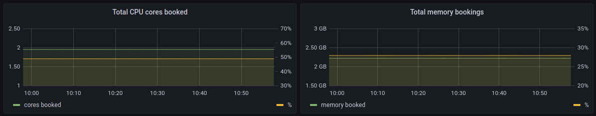
Bookings
The bookings chart pair shows the nominal and percentage value (on the second y-axis) of cluster resources used. You can get notified when your cluster is getting overflooded with workloads by setting an alert on these charts. Should you not have autoscaling enabled for your cluster, this alert can be a trigger for scaling the cluster.
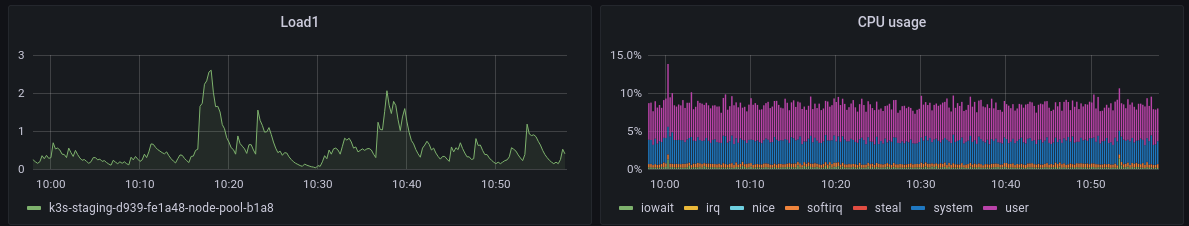
Load and CPU
The emphasis here is on the load chart. A load chart is often a better indicator of malfunctioning than the CPU usage chart. In essence, having 100% CPU usage is a good thing in terms of price-performance.
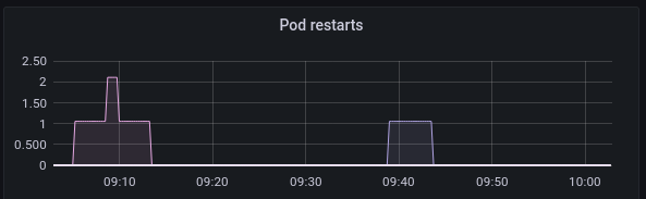
Pod restarts
This widget is a good place to find crashlooping pods.
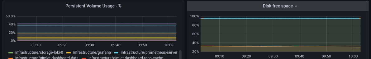
Disk space
This chart pair keeps track of free disk space. Both in Kubernetes PersistentVolumes and on the hosts as well.
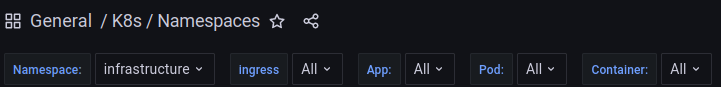
K8s / Namespaces
A templated dashboard allows you to deep dive into how workloads behave in various namespaces.
First, pick a namespace in the dropdown, then you can drill deeper based on specific labels(app) and identifiers (pod, container name).
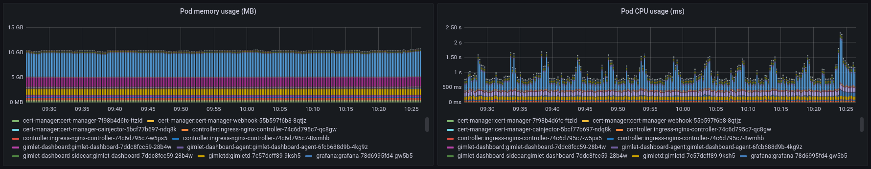
Memory and CPU usage
The most important charts on this dashboard are the pods’ memory and CPU usage ones. These provide a real-time view of how much resources your pods actually use. You can spot increased memory usage or busy pods.
Ingress traffic
You can also correlate hardware usage with the received traffic. The top two charts show traffic data from the Nginx ingress controller.
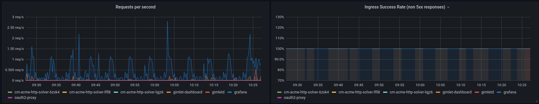
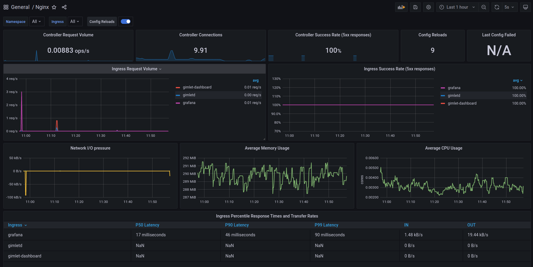
Nginx
The Nginx dashboard offers a comprehensive overview of all traffic the Ingress Nginx controller serves.
Request volumes, success rates, and response time percentiles give you good tools to troubleshoot your system. You can correlate usage patterns with metrics you see on other dashboards.
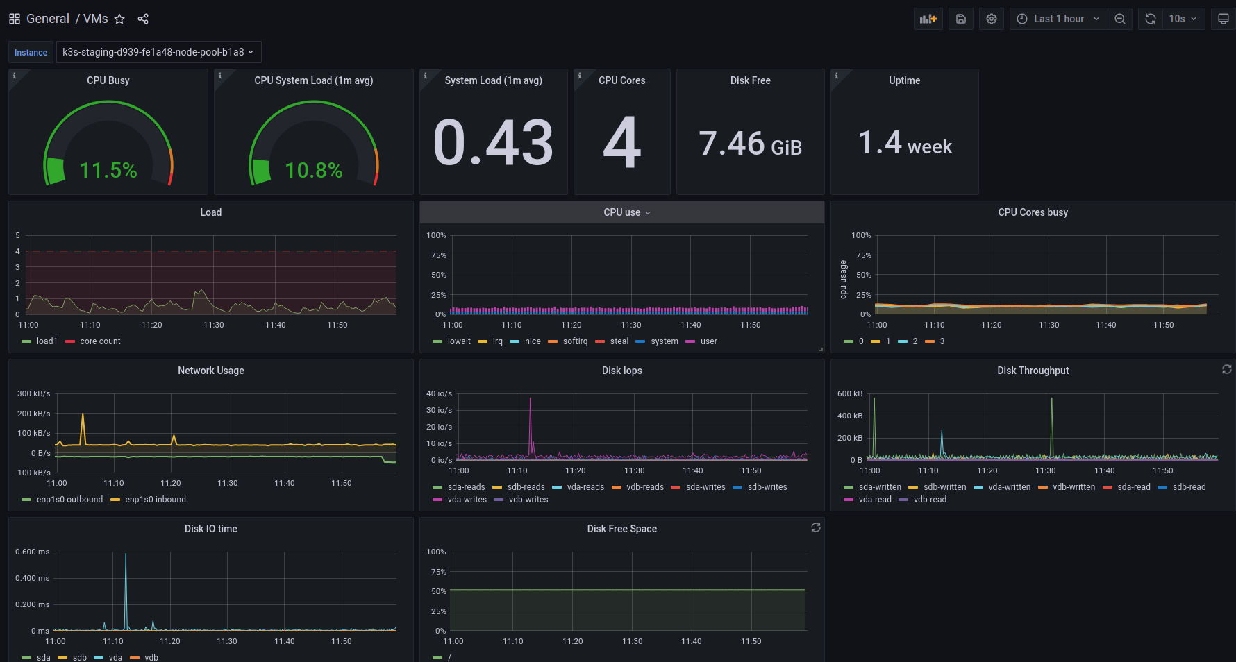
VMs
The VMs dashboard gives you the well-known host metrics, focusing on a single virtual machine.
Linkerd Top-line
Linkerd is a lightweight service mesh that proxies all traffic between your container workloads.
This puts Linkerd into a unique position that allows it to give you traffic metrics between your pods out of the box.
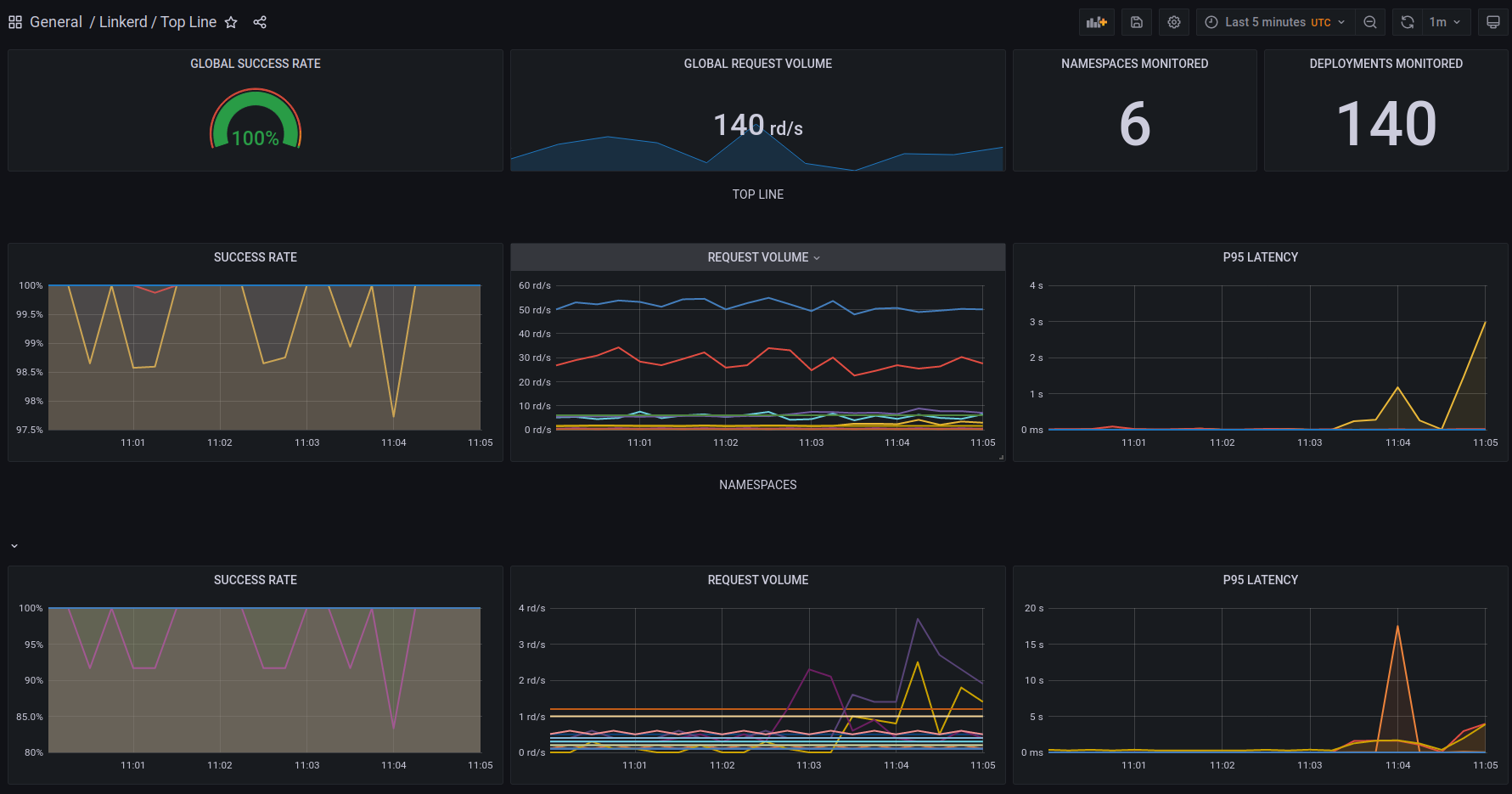
This dashboard is a good starting point, if you question your system's health. Error ratios, response time percentiles, and request volumes give you the perfect insight into pod-to-pod communication to spot if a pod is failing.
Unlike the Nginx chart, the Linkerd dashboard is able to monitor pod-to-pod communication as well, not just at the edge of your platform, at the Ingress level.
With its Linkerd / Top-line / Namespace counterpart, you can do an even deeper dive in those metrics, focusing on a specific subset of your platform.
Linkerd Deployment
If you narrowed down your troubleshooting onto a single deployment, you can examine it more thoroughly with this dashboard. It gives you an error ratio, response time percentiles, and a request volume on all inbound and outbound communications on a given Kubernetes Deployment. Giving you great tools to understand your system better.
tip
A common misconception: traces do not come from service meshes.
Request traces that span across multiple services are often demoed together with service meshes. It is important to highlight that traces do not come by default with the usage of service meshes. You still need to propagate request IDs across service boundaries to be able to generate the trace of a request, as it is traveling through multiple services. See the # Distributed tracing in the service mesh: four myths blog post.
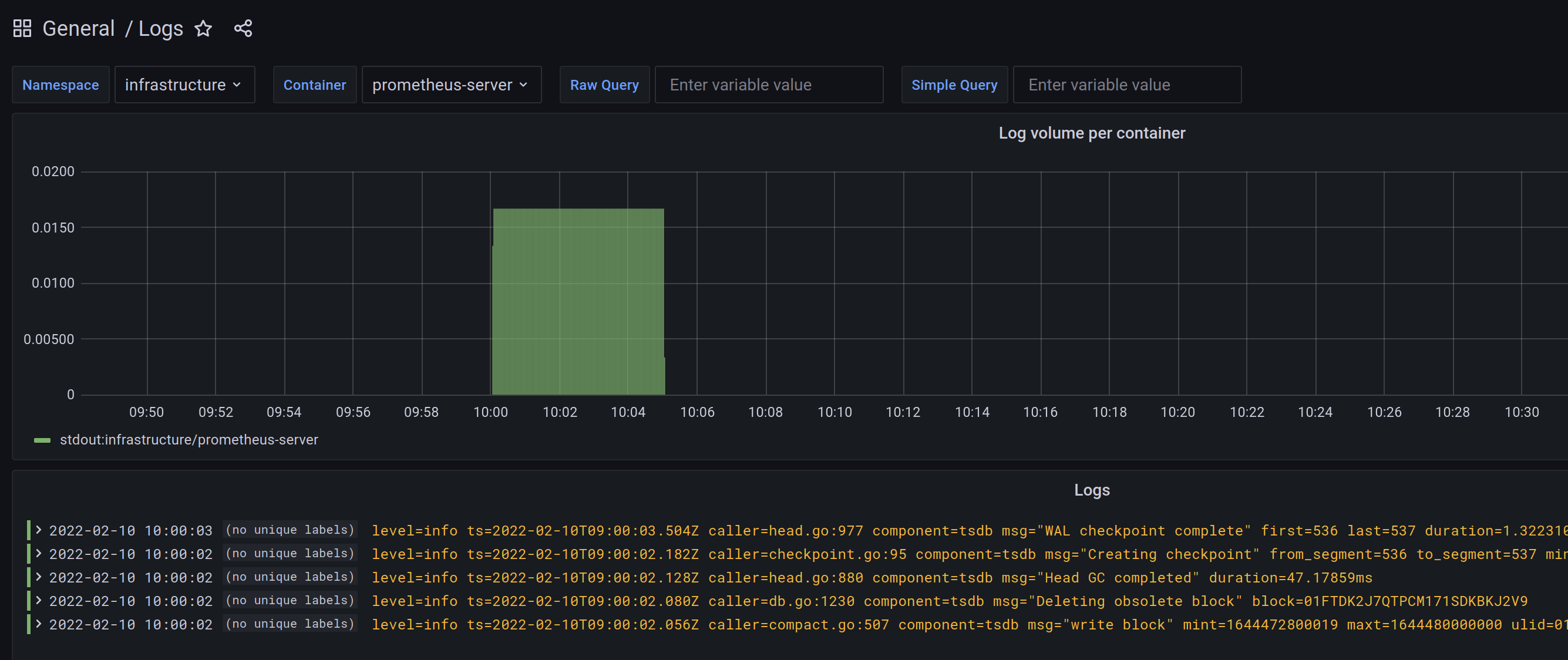
Logs
The logs dashboard is where you can query Loki logs in Grafana.
It has a namespace, a container filter built in, and two querying fields:
- in the raw query field, you can type standard Loki LogQL queries.
- in the simple query field, you can type any string which is going to be matched like the following regex: .$simple_query., basically meaning every log line where the given string is present.